SPUDSY
PACKAGING WITH PERSONALITY
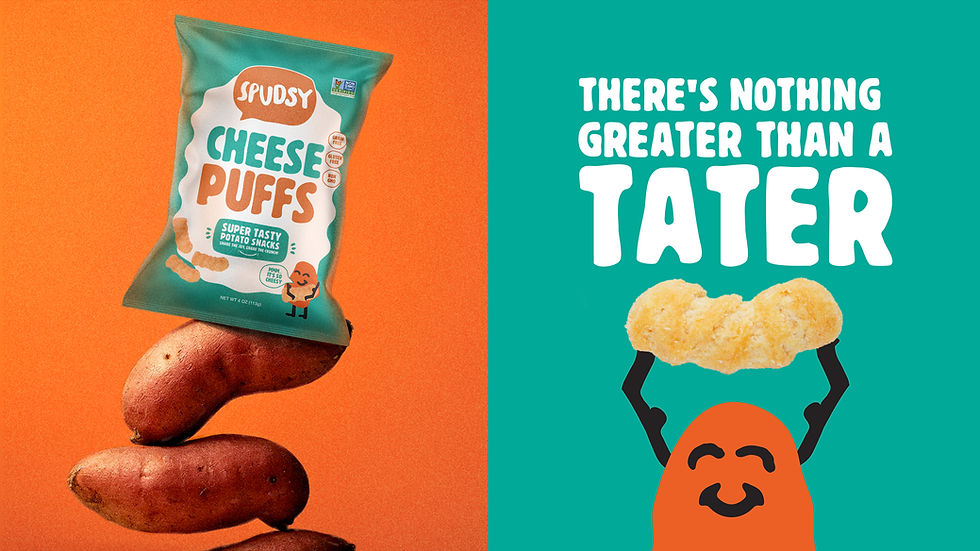
There's nothing greater than a tater!
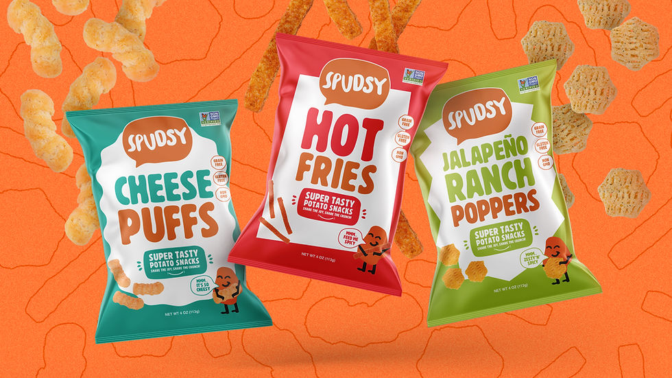
Spudsy makes superfood snacks for everyone to enjoy. Using only upcycled spuds, they offer multiple lines of super tasty potato snacks that bring a better-for-you bite to any snack time. Our objective was to design new packaging for all three varieties of Spudsy snacks – Puffs, Fries, and Poppers – to help them stand out on shelf and make the Spudsy name more recognizable.
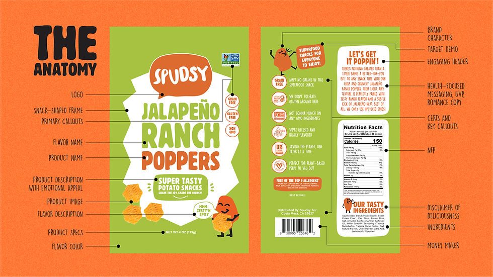
To create an intrinsic visual relationship between Spudsy's offerings, we defined universal architecture across all three designs with a large, centered Spudsy logo. For delineation, we developed distinct graphic borders to frame the front panel text, inspired by the shapes of the snacks inside each bag, Sticking to Spudsy's design guide, we leaned on color to communicate flavor and used color blocking to ensure the packaging always pops, no matter how much of it may be blocked by the shelf lip.
Copy also played a big role in our execution. On front-of-pack, we employed approachable, family-friendly descriptions of both product and flavor, with playful use of the animated brand character. On back-of-pack, we further amplified the brand's personality, adding quips to the callouts, fun to the health-focused messaging, and romance language you can almost taste.
• Packaging Design
• Creative Direction
• Brand Storytelling
• Copywriting
• Graphic Design